The Creation of 'Seasons of Life - Japan' Photobook
- Jack Hamilton

- Sep 3, 2021
- 7 min read
With the release of my new photobook, I thought I would do what I've done in the past and share a bit about how I created the book from start to finish.

In February I came to the decision that I wanted to make two photobooks for the year 2021. One completely new and the other from photos I have already previously taken. I wanted to put together a book dedicated to the photos I took while in Japan in 2017, so I spent a few weeks going through the archives and organising which photos I would like to use.
Alongside this, I started a new project that has me go out into the city on Saturday nights and document street and club photography, a project I have had to put on hold with lockdown and restrictions in place. I'll save that post for when I can finally complete the project.
After going through all the photos I took while in Japan I managed to condense the number down to 250, as possible photos to use in the book. I printed 4x6 sized prints from Big W of the selected photos and laid them out to start pairing and further fine combing.
A first run-through of laying them out on my bed and pairing them in brief order saw 63 photos cut out of the selection, bringing the number of photos to 179. I then went through again and looked more at the pairings and overall colour palette and theme. Being a bit more harsh but necessary, I cut a further 58 photos out, bringing the total and final result to 121 photos.


When doing this, a few positions of photos changed, as well as some of the pairings. It can be hard to seek outside advice sometimes, even harder to take it on board when it's your own personal work being spoken about, but I went to my friend and boss who is also a photographer and got him to look at the book layout in InDesign. He gave me some good pointers I took on board and suggested pairings that would work better together.
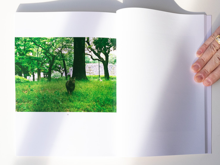
After the first run-through of having the photos laid out, I spent a bit of time going back-and-forth with what photos to open and close the book with. For the opening photo, I thought about what best sums up the book and what style and feeling I wanted it to convey for the rest of the read. I decided to go with a favourite shot of mine of Osaka Castle. It's a Japan icon I visited in 2017 and the colour palette really resonated with me. I started the location of the book in and around Osaka castle that carried the green and white colour palette and slowly transitioned it over to white/pale, to orange, back through a mix of both and then into warmer tones, ending at a night time setting. I finished the book off with a shot at a small street temple in Osaka, I believe it's Hozenji Yokocho Temple. It felt intimate and calm, a nice note to end on.


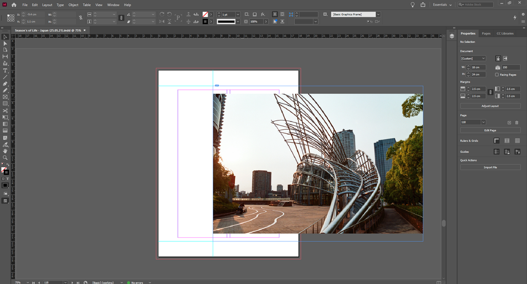
I already started to edit the book in InDesign before reaching 121 photos, so as I was editing I knew I didn't like having such a high page count but couldn't see myself taking many photos out. At first, I made a few more new pairings to bring the page count down but also knew photos would have to come out eventually. Once I had the first pass on the book layout in InDesign I looked at what didn't fit well and what was unnecessary to the idea of the book. That's when I started to slowly take single photos or pairings out that didn't end up meaning as much as I initially thought to the project.
The idea for having the book go from day to night, bright colours to darker colours was already there before I started to sequence, so that gave me some purposeful motivation to the layout and pairings when that stage came, making it quite a fluid process.

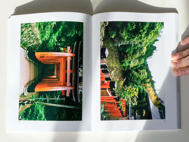
I also knew a strong focus of the book would be diptychs/pairings. The inspiration for this came from watching Alec Soth's video 'Real-Time vs. Story Time' on his YouTube channel. He speaks on the topic of photobooks that have diptychs that almost look the same. Photos that are taken seconds apart and how that works as a concept applied to pairings in a photobook. The photos I took in Japan are very similar to the ones he reviewed in the sense that they were taken in the same or similar position and angle, and shot relatively close together in time. I wanted that to become part of the theme in my book. Pairings that looked very similar and would motivate the viewer to look closer at the details of each photo.
You can check that video out here https://www.youtube.com/watch?v=ON9pkhJaSPI
Editing the photos I found to be the hardest part. Creating a colour palette that fits with the majority of the photos. Since there were photos taken at daytime and night time being used, editing them with a pre-set I created would not exactly fit well with both settings, so a lot of fine tweaking occurred. I ended up with 3 different edits of each photo and that happened over time. I did a first edit of the 121 photos and found that the end style was too cold when looking at the book as a whole. Two weeks later I did a re-edit of the photos with minor tweaks and changes in temperature and found the skin tones were too warm (an issue with my monitor settings. It's a good idea to view the photos on two separate computers to see if they look different. I viewed them on my desktop at home and a MAC at work). A week later and the third edit, I found the balance in my greens and whites, and a nice slightly warm tone in the photos. More tweaking would occur later when going through the locked off book as minor changes that would elevate the end result.
The majority of the photos used in the book are 35mm so there was a lot of dust cleaning and I even found myself taking out certain elements in the photos, such as marks or cracks on the ground, sticks that looked weird in the trees, wires that took away the symmetrical element in photos, and the dirty edge of frames that didn't work. I really picked the photos a part which I don't often do when just posting to Instagram. I think it's a good practice to really delve into a photo and the end result you want to achieve and be happy with, instead of just doing a colour grade and aligning the photo. I often get lazy and leave those imperfections in but since this is going into a book people will hopefully continue to look at over time and won't be altered again, I made sure to be content with the photos.
I ended up doing a lot of this work at the same time which ended up cluttering my file organisation but I was able to work around that. When I got the majority of the photos locked off with their edits, I started to look at placement on spreads. I had the photos in their pairs but the placement on pages wasn't locked in yet. I decided instead of having the photos directly in the middle of the page vertically, I would have them closer to the 30%-40% upper part of the page. I also threw in a few 3 photo spreads and diptychs flipped vertically so the photos would be bigger to show more of the detail in them. For the single photo spreads, I played around a little but not over the top with placement. A lot of the photos I wanted to have across a whole spread didn't sit well as the middle element of the photos would be cut off when the page leads to the bind in the centre, so I placed some of them across 1 and a 1/3 of a page, or 2/3s so the main element was still visible and you could tell that it was the focus of the photo.


The biggest issue I ran into with the book would have to be having it read backward as traditional Japanese books do. Flip right to left. This ended up being an issue with page numbering and photo numbering when I was pulling photos out that I no longer wanted to be part of the book. I would have to go back through and count the pages and photos and write the total again in the glossary I created. It was very tedious.
For the size of the book and paper stock, I based that almost 100% off of a book I own. 'Lait' by Alexandre Souetre. You can check it out here - https://axlsouetre.com/LAIT
I remember purchasing it and loving the size and minimalism of the design. I knew I was going to have over 100 pages and so the cost would have been an issue to go bigger. 24cm x 18cm just felt right for a design and theme like this. A 'Seasons of Life' collection is something I would definitely like to carry on with my past travel photos and I would lay it out and theme it much the same as I have with this book.


The reason and motivation behind making this book comes from the feeling of not wanting my past to just die off. I want to share it, have a physical representation of it, not just a digital recollection of memories on a computer. It's selfish and nostalgic. It's a visual blog and diary. It doesn't fit anywhere other than where it is. Its focus isn't a creative one as such, there is no challenge or meaningful direction for it. It's purely a personal piece of work, one I thought I would share and maybe other people can find a form of connection with it in their own way. The timing of making this however feels like a fitting reason. Travel bans in place with lockdown restrictions. This book can be an escape over a coffee in the morning or a tea in the afternoon to another country. Japan.
If you would like to purchase a copy of the book, follow the link here - https://www.jackhamilton.online/product-page/seasons-of-life-japan
That's all for this post. If you have any questions, leave a comment or send me a message, I'll be happy to answer any.
Thank you,
Jack Hamilton


Comments