Re-visiting Travel Photos - (U.K Part 4 - October to November 2017 - Digital)
- Jack Hamilton

- Aug 21, 2020
- 4 min read
Hi all!
This week's blog post is part 4 from the U.K 'Re-visiting Travel Photos'. These photos were taken between 15th October and 25th November 2017.
Some of my favourite photos are featured in this post, I hope you like them too.
A little background into what was happening at the time in London. I started my E.B.S course (European Bartender School) on 23rd October. The whole reason Caroline and I chose to travel to London, so it was pretty exciting and nerve-racking at the same time. The course was a month-long, finishing 20th November. I had my 21st birthday on the 10th of November, going out with the guys from the course and Caroline to some amazing cocktail bars. Adventure Bar (which I ended up getting a job at), Roadhouse (where they hold the world flair competitions), London Cocktail Bar, and Be At One.
During this month of studying, we booked an Airbnb for the duration of the course so we weren't moving around while I studied. The hosts Bella and Dexter were so kind and fun to be with, making the apartment feel homely. We went to a Haloween party with them, as pictured below in the costumes.
Lots of drinking, late nights, city exploring, and cocktail learning happened in October and November.
Lets breakdown some photo edits!
I've organised the photos as always, into groups. Overall there are 95 photos, but grouped up in original, edited, and re-edited are 19 sets.
Let's look at these ones first.
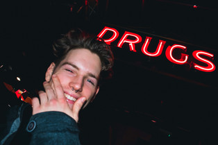
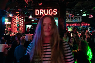
Johnny's Chop Shop! I absolutely love the colour scheme in these photos. Mainly to do with the location and what colours were on sight, but the edit of bringing them alive really helps, especially with neon signs.
I've been getting into photos colour schemes a lot lately. One of my favourites is a coffee blend tone. Strong whites and browns. Warm tones. But I also love the ice cream shop tones. Strong whites, as well as pastel blue, reds, and oranges. As seen here, we've got a white canvas being the building, and then the strong source of colour, being the neon sign.
(Re-edit)

With the older edits, I flattened the whites, making the image faded, and changed the hue of the blue and reds to lighter tones. Blue to aqua, red to orange-red.
I knew for the re-edit I wanted the whites to pop, and stay true to the colour hues.
I still really like the original edits, but wanted to try and more 'modern' edit style.

Moving onto the girl with the red scooter and street drummer. I kept a strong colour focus and 'modern' edit style. With the original edits, I am still diving into the aqua shadows and flat whites, like all the other edits from previous UK photos, have. I decided to add a little bit of this style to the rainy and cold photos, to really emphasis what London is really like. Cold and wet, pretty much all the time.


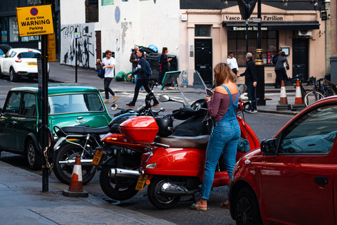
The red jacket man is one of my favourite photos and my original edit didn't do it justice. I added some aqua tones to the glass and slightly brightened the buildings around him. Since he is the main focus, I emphasised the red in his jacket. I was thinking about getting rid of the reds on the buses, like I did to the ladies scarf on the right side of the shot, but realised they are a London icon and deserve to be noticed. I upped the whites, gave the photo a strong polish look with the de-haze bar, and brightened the photo for a pale, cold finish.

The photo after the red jacket man is also one of my favourites. The London Shard. I followed the same editing technique as before, but without the red focus. Since the glass building is the main focus, I made sure to emphasise it. A little aqua tone in the glass, de-haze for a polish look and up the whites. Another step I took for making sure the cold, low cloud fog was pictured strongly, was up the highlights by 20%. Too much of it washed the whole picture out. I only wanted to cover the top of the Shard so it faded off at the top of the frame. The shadows and blacks were added to take away from the sides of the frame as the main focus was the centre.

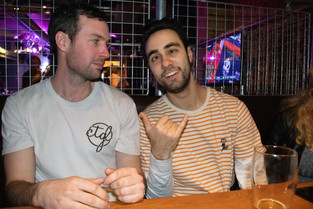
The next lot of photos taken while out drinking are just basic re-edits to get rid of the flash highlights while keeping the picture bright and skin tones true. Gonna skip over those and go to the re-edits without original edits.
The first shot in this list is of a bush in the middle of the city. I love this one because the focus is so spot on that it separates the background from the foreground, even with the solo branches sticking out and in front of the building in the background. They're still in focus and prominent. I like that it's bright. Even the colours themselves are brighter. The greens of the bush are a lighter shade, and the red flowers are very lustrous.

The rest of the re-edits are more shots from the sets that didn't have original edits so I won't go into those as they've already been touched on.
The last lot of photos are just the edits themselves that didn't have original files so I couldn't do re-edits for them.
I wish I had the original file for the Dodge Plymouth sign and the small green car. I would have enjoyed editing those ones again.


That's it for this blog post.
If you would like the next 're-visiting travel photos' to have some shots from inside Lightroom of the editing process like the last post had, let me know and I'll happily add some in.
Thanks for reading and enjoy the photos.
Join me next Friday at 12 pm for another blog post. Until then, stay safe.


Comments