Re-visiting Travel Photos - (U.K Part 3 - October 2017 - Digital)
- Jack Hamilton

- Jul 31, 2020
- 5 min read
Welcome back to another 'Re-visiting Travel Photos' post. This week we'll be looking into Part 3 of the U.K photos.
I've been really paying attention to the photos I have on my computer, seeing which ones have the potential to go into the shop and which don't. All of this really relies on the re-edits. So I've been putting more time and thought into each edit that I think is worthy of wall decor. The ones that aren't still get edited, but with less effort.
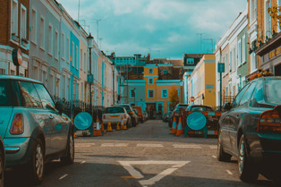
For this lot of photos, I started with a different approach than usual. Instead of going through the presets I already have, I made a new one, which I only applied to the first photo shown here.
The shot of the underground sign I knew I wanted to be a cold colour palette, with the focus of colour applied to the center of the image where the sign is. I only used this preset for the first photo, and that's because all photos after had much more of a reason to have colour lifted and emphasised for brightness and tone. So I made another preset for these photos.
I still followed the path of the already edited photos were on, but with more focus and balance. I stepped away from the warm and faded tones, and instead, replaced them with cooler and cleaner tones. I wanted to bring the colour out of each building without saturating the image. So I moved the hue bars around until I got the colours I wanted, which for most images were pastel tones (peach, terracotta, burgundy). This was done easy enough as I didn't have to worry about skin tone as there were no people in the photos.
A lot of the images had messy rooftops with wires and antennas everywhere, so I did my best to remove or cut them out of the photos. For the ones that still have them, I tried to remove but found it to look messy with noticeable blotches of the cloning tool.
I straightened and scaled images to align and balance the corners and subjects in the frame. I found most images to have messy corners, so to have them not interfere with the photos, I either cut them out or lined them up to be fully in the frame or balanced on either side.
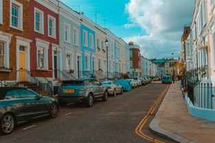
Take the shot with the covered car in the center. There is a car on either side of the frame. To balance it out properly, I scaled in and moved the right corner out of frame, removing the green house from view, which cut the right car off to the amount the left one was in the frame. The covered car is now centered, with both cars having even amounts visible. This helps read the image as balanced.
It really helps to take photos wider than you want to so you have room to move the image around when editing. Majority of these photos I scaled in and lined edges up. If I had of taken a photo with one corner of a building in the shot but the other corner out of shot, I'd only have one option which would be to cut the other edge out to bring balance back to the photo. Whereas if both corners were in the shot, I'd have two options.
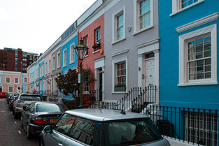
You can see an example of this mistake with the blue door photo (second image row). I didn't show enough of the handrails in the shot, which has left them imbalanced. If I had of shown the whole rail, or at least more of it, I would have room to edit how I wanted it in the frame. But by cutting it out as I did only allowed me to adjust it slightly. Just enough for it to pass.
After applying the preset I made, most of these images only had their framing adjusted, shadows moved around, and cloning tool used.
The preset did most of the job as all the images were taken in a similar setting. The preset looks like this.

On the right, you've got the white balance, tone, and presence bars. The image was shot at 5250, I wanted to go a little bit warmer so I adjusted the white balance to 5300.
Contrast helps split the highlights and shadows, making them have a stronger presence independently. Putting it to +10 gives it a little kick in each colour.
I wanted the image to be brighter and shooting your image either on or just under the right exposure gives you room to adjust in editing. I shot the image flat and a little underexposed, which gave me room to bump the exposure up by half a stop. I didn't have to lower highlights which I often find myself doing.
Bringing the shadows up gets rid of the dark blacks. The image already has strong blacks and so I wanted to get rid of the strong contrast between the shadows and highlights while adding brightness to the image.
Texture is a new feature to lightroom which is what clarity kind of did but refined. As the name suggests, it adds texture to the elements in the image. I wanted to bring out the detail in the buildings and gravel, so I put that up by +30.
The image already has a lot of colour in it, so I only added vibrance in to the image. Only a little bit, helping the colours pop.

The tone curve is something I'm still trying to get better at. For mine, it's very sensitive to adjustments. The bottom of the curve is the blacks and the top of the curve is whites. I tend to just follow the standard 'S' pattern. By lowering the curve in the blacks, it makes them more stronger and saturated. By raising the whites, it brightens the highlights in the image but done too much either higher or lower, will blow the image colour out, or crush it.

Here is where most of the image is. The HSL bar (Hue, Saturation, Luminance).
I only adjusted the hue as I didn't want to add more saturation or brightness to certain colours.
The hue bars allow you to change the outcome of a certain colour. For example. If you have a dark blue sky and would rather it to be aqua, you can slide the handle of the blue hue tab to the left, changing the blues in your image to a light blue.
The same goes for every other colour.
You can see that I wanted to have brighter colours as the sliders are all going left.

Along with the hue adjustments, I went to the calibration section and changed how the RGB (Red, Green, Blue) reads in the image. Using this section gives you a quick result for colour adjustments.
I hope that helps you understand a bit about photo editing in Lightroom.


As always, join me next Friday at 12 pm for another blog post.
Until then, stay safe.


Comments