Re-visiting Travel Photos - (Melbourne - Part 2 - 2017 - Digital)
- Jack Hamilton

- May 29, 2020
- 4 min read
Part 2 of Melbourne 2017, takes us through the months, March, April, and May. This is the last part of 2017. The next digital photos from Melbourne will be from 2018.
So by now you probably know the drill. Just like the other 'Re-visiting Travel Photos' posts, I'll break down the photos into Original, edit, and re-edited where I can, and talk about the differences such as Colour, style, and framing over the years.
With the selection of photos I have today, only one group has edits from back in the day already. I'll separate those to make it easier for viewing.
These photos were taken around Parliament Station and China Town in Melbourne. The dates on them are 17th April 2017.
| Original | | Edit | | Re-edited |


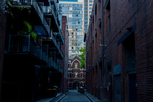
Already I can see that with the original edits, the overall brightness is much higher than on the re-edits. I do like it as it draws the viewers attention to the photo much more than the darker re-edits do. It helps the colours pop and come alive. However, it isn't necessary and at times gives the photo an overall gimmick feeling. Unnatural, forced and over the top. Although it feels like a theme and that is good. Having your photos come out of the edit feeling interlaced and related through style, or colour, or framing really helps the viewer read the images easier. It also helps sell the fact that you know what you're doing. You put thought into not just the individual photos, but the overall look of your gallery.
Looking at the re-edits, I can see I have added more blue/teal into the shadows which feels unnatural but creates a style. The photos are much softer, and the highlights and shadows have changed opposite temperatures, giving conflict in the photos, but to me, doesn't feel distracting. Sometimes it can take away from the image, seeing a large change in colour between the highlights and shadows.
The shadows are much darker, and the highlights are quite low, saving the detail in the brighter parts of the image.
I also notice that I never used the vertical and horizontal positioning tool to straighten the images up, as I do now. It really helps your image feel stable, balanced and centred.
The only photo that looks better than the re-edit to me, is the escalator in the train station. The only thing I would adjust is the overall brightness, lowering it slightly. The white balance is perfect, making the temperature of the lights look great.
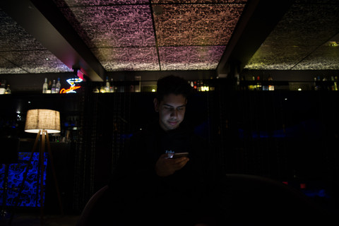
The next lot of photos are from a day spent around St Kilda with a few mates. There are no original edits. But I will put the original photos next to them so you can see what was done with the colours and framing.
These were taken 18th March 2017.
| Original | | Re-edited |


A lot of photos I've been editing lately, I tend to de-saturate the greens. I don't like the green tinge you get across photos sometimes. I put the tint 6% higher in the purple, and bring the saturation of the green down to -60 or lower.
It also helps bring the faded look I go for alive. The whites are also brought down.
When editing these photos, I noticed how much I didn't look after my lenses. The dirt marks are not easy to get rid of when they are so easy to see in clear colours.
With editing, I've also been making the photos softer. Bringing the clarity and sharpening down to the 0/-10 area.
There isn't too much to talk about with these edits. Just a few slight adjustments to the Hue, softening out of the images, straightening them up and bringing forward the focal point I want to be noticed.
I do this by de-hazing the area I want focused on with the brush by 5+, putting the clarity and Sharpening up by 5+ to 10+ as well. I have my whole image at -5 de-haze and as such, the focal point chosen will look more clear compared to the whole image because of it.
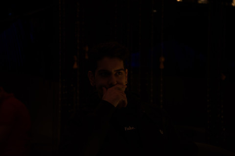
The last lot of photos are from a day out with my friend, using his new camera which is a Nikon. We went through China Town and a few off-street clothing shops.
Again, these had no original edits with them.
These were taken 7th May 2017.
| Original | | Re-edited |


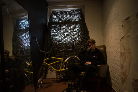


The biggest difference I can see with these photos is the temperature and the blacks.
The temperature is much colder, sitting at around 3000-4000, whereas the original photos are at around 6000.
And the blacks have been bumped up on the tone curve, taking out the detail, and fading the dark points in the picture.
Saturation is also a large part of the differences here. The re-edits are de-saturated for the soft look I was going for. Very noticeable in the pictures with the red neon 'pulp' sign. It actually makes the sign look brighter.
I'm happy with how these re-edits have turned out, some are a little bit over the top, but the style I have curated here is nice. Dark, moody, cold, faded. I seem to have a re-occurring pattern and I like where it's going.
Thanks for reading.
As mentioned at the start, the next lot of photos from Melbourne will be from 2018, but before we look at those, I have a few other posts lined up.
Tune in next Friday at 12pm for the new post.
Thanks.


Comments