Re-visiting Travel Photos - (Melbourne part 1 - 2017 - Digital)
- Jack Hamilton

- May 15, 2020
- 3 min read
Updated: Jun 20, 2020
Following on with my previous 'Re-visiting Travel Photos' posts, this one will be about the digital photos I've taken in Melbourne.
With this one, I've noticed how much my editing has changed after re-editing these photos to post. So instead of sharing a bunch of photos already edited, I'll show you a comparison side by side with original, edited, and re-edited.
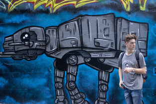
The oldest photos I could find that were taken on digital camera were these ones from March 2017.
Not all of the photos had an original edit, so I've added a place holder to even out the comparisons.
(More writing at the end of photo post)
| Original | | Edited 2017 | | Re-edited 2020 |


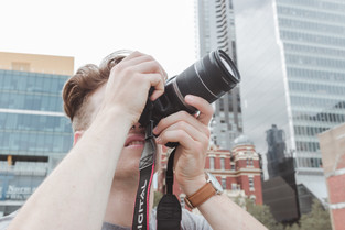


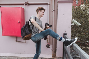


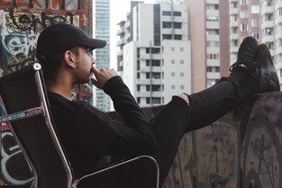


After viewing these side by side I can see how much my style of editing has changed, and I have also come to realise that a photo doesn't have to be drastically edited to say it has been edited. I remember when I started taking photos and how annoyed I got that I didn't have my own style, or comparing it to others and being upset it wasn't as good as theirs. After a while, I just stopped taking photos and focused on filming. It wasn't until I started using my film camera more often that I got back into digital and noticed a change in my style of editing. I love how film turns out and I think it has had a large effect on how I edit my digital photos. Putting these side by side I can see that I have obtained a 'faded' look.
Less contrast, less saturation, more natural tones, especially skin tones. There's no pop in colour and the temperature is much warmer.
I feel I have integrated this style from the use of 35mm film. I tend to add grain into my photos now and minus the de-haze for the 'faded' look.
For some, they won't like this type of style, but at the end of the day, it is not about impressing others, it is about impressing yourself.
It might seem selfish but if you're not happy with your photo edits, but others are, I wouldn't call that a win.
I use to look at Sam Kolder's photos, much like many others would have or still do, and so desperately wanting to get the 'orange and teal' look. That is why in my previous edits, the blues are so big and skin tone is heavy. I'll admit these original edits still look good, but are just too contrasted and saturated.
When I use to edit, I never used the vast amount of tools that are available in Lightroom. I would skip the use of the tone curve, split toning, detail tab, lens corrections, and transform tab.
Now after 3 years of photo editing, I feel only now that I am understanding how to edit a photo. With much to still learn of course.
If you were to leave with any message from this, it would be to not compare your work to others negatively and to not try and force a style. Just let it happen over time and practice.
My style between photos always changes, and I'm okay with that.
If you're trying to force an 'orange and teal' style on a predominantly green photo it's just not going to work. You can either let the photo decide how you edit or put more thought into what you shoot, so you always have control over the editing style.
Both have worked for me, so put it to the test yourself and see what results you get.
Thanks for reading!


Comments