Photo-Zine Update - Faithful Sydney
- Jack Hamilton

- Jun 19, 2020
- 9 min read
Updated: Dec 18, 2020
Hi all, today's blog post will be on a Photo-Zine I've been working on. In the last Photo-Zine update, I talked briefly about the pre-production of a couple of photo-zines. Today's post will be about one specific photo-zine I'm currently working on.
That Photo-Zine is - Faithful Sydney.
I decided to start my first ever zine with this one, mainly because of its size. The zine consists of 16 Black and White 35mm photographs, all taken in Sydney on one film roll from 2017.
I originally had plans to create my 'Night Life' zine first but when I came to editing these photographs, I found it to be much quicker and therefore smarter to start with this one first as it was overall a more focused idea.
I wanted to also start with something quick and simple because I am currently in the middle of shooting another Photo-Zine which will take up most of my time when all the photos are collected. So having a straight forward goal for my first zine would be extremely helpful when I start on my second zine.
I really wanted to get an understanding of the printing process and I found that there is a lot more to printing your zine than just sending off the layout.
The basic knowledge I knew was knowing the size you were printing (A3, A4, A5), landscape or portrait, page count, and the information provided within InDesign (bleed lines, borders, margins). When I got to the stage of looking for printing shops and getting quotes, I found out quickly that there was more I needed to provide. For example, you need to provide the paperweight, what style paper (gloss, uncoated, matte), the binding style (perfect binding, wire binding, saddle stitch), and the books cover style (self-cover, hardcover, laminated hardcover).
There is a lot more information beyond this you need to provide the printer but I'll leave it at that.
While I was going through the selected photos for 'Faithful Sydney' and designing the layout, I didn't actually have the title in mind. It wasn't until I realized the strong motifs of religion and faith that were held within the photography and style of the zine, that I settled on this title.


With the 'Meet Me In Heaven' neon sign and photos of St Mary's Cathedral, I decided to follow the religious theme, and as soon as I got into that mindset, I noticed the other shots could be seen and read as holding religious meaning or fall into the overall theme I was now focusing on.
I'll go through the steps I took to get me from pre-production to a locked zine-style, ready for printing.
In my other post about photo-zine pre-production, I touched base on how I chose what photos to include and a basic layout idea I had for them on paper.
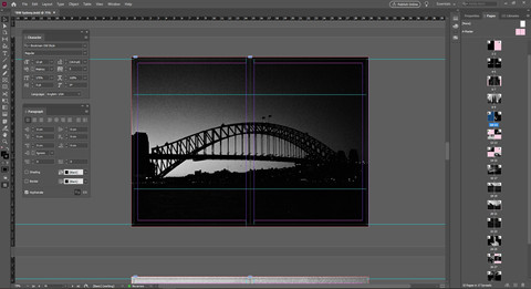
This is what that looked like.

Each pair of black and white photos represents 2 pages. I would place different photos next to each other until I felt two fit well together, and then wrote page numbers on the back of the photos. Once I did that I applied the page numbers into the files on my computer to keep track of it all.
For the most part, I stuck to this layout when bringing the photos into InDesign. I took another step after this and stuck the photos into a diary to further the idea of what they would look like represented in a book.


When I took the pictures and put them on pages, the layout changed a bit. I didn't have as much freedom doing it this way because of the photo sizes, and the placement on paper completely went out the window when I got to InDesign. For good reason too. It looked shocking like this. But the one thing that stuck was the pictures that worked well next to each other. I kept the pictures paired in twos when coming into InDesign but ended up putting most individually on a spread, having its pair on the next spread.
When doing the layout in InDesign, I watched a video on YouTube to get an understanding of how to use the program and move around using the tools. I watched Nick Exposed's video on 'How to design a photo zine in InDesign' (link here).
It helped me so much with working InDesign and I recommend anyone learning InDesign for the first time to watch the video. Along with helping me learn the controls, the video also goes in-depth with laying out a zine. Other videos of Nick Exposed that helped me was his video on 'Sequencing and Layout' (here) and 'Layout and Design' (here).
Watching these videos made me rethink the layout I had in InDesign so I could get the most out of what I was presenting.
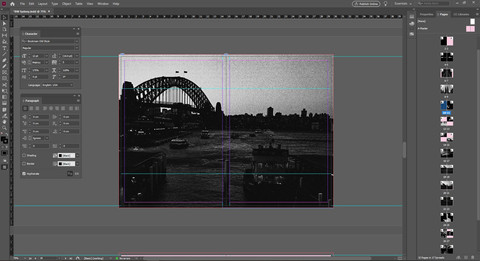
And so I went through the layout again and changed placement and sizing. Ending up with this layout.


A few stylistic choices changed and evolved along the way which I'll dive into.
As for the layout, I am happy with its final form. Seeing the idea go from small print-outs lying on the floor to a fleshed out design ready to be sent off fills me with relief and pride. It's always a small burst of euphoria to see your work come to life and presented in physical form (we're not there yet but soon).
You've probably noticed I dropped a few images from the start and adding a couple when I got into InDesign. That's because I decided I wanted the photographs to be all from Sydney as the title suggests, making it focused. All these photographs have all come from one roll of film as well.
I changed the layout so I had more images spread across two pages. Presented bigger so more detail can be shown, to add emphasis to certain images, and to have a variety of different layouts and spreads to keep the viewer interested. Not knowing what the next page held in terms of layout would keep the viewer eager, turning the page to find out what position the pictures would be placed in next.
I originally had a spread with these two images on it.

I paired these two as it signals two forms of transportation. The placement of having the shoe photo lower on the page is because of the angle the photo was taken. Looking down. So having the shot of the newspaper reader higher on the page made sense because of its angle it was shot at. It also draws the eye from the bottom left of the page to the top right, drawing a line.
I decided to drop this spread because it strayed too far from the overall theme.
Instead, I took it out and moved the spread that came after further up the page to now be paired with the water and church window, keeping the style and layout of 2 images on one spread. Drawing a line with the eye from bottom left to top right, then flipping the page and drawing another line top left to bottom right.
Seen here.


Since I wanted this zine to be 32 pages and it was now 30 pages from removing the spread, I added a photo that I should have added earlier but looked over. This one here.

It ties in perfectly with the theme and leads into the next photos on the spread with ease.
Naming the zine - Faithful Sydney - gave me two ideas to focus on. Faith, and Sydney.
Having all the images taken in Sydney made Sydney's aspect pretty straight forward to follow, and starting the zine off with the photo 'Meet Me In Heaven' gives the whole idea of 'faith' as the main theme a very strong start.

The viewer knows that this zine will be exploring the meaning of faith with photos taken in Sydney, right from the start. But having the writing represented by a neon sign gives it a little style and freedom of exploration. So now, this zine becomes an exploration of faith from a different point of view, with Sydney being the location and outlet.

The next page spread is of stairs leading up with guiding lights on either side. Having this as the following image was a strong placement choice. Seeing 'Meet Me In Heaven' and then a shot of stairs leading up; It speaks 'stairway to heaven' like nothing else.

Flip the page over again and we have a beautifully centered shot of St Mary's Cathedral. Again, a strong image to follow with, laid out as a full spread to emphasize the importance. Very strong 'faith' themes to start the zine off with.
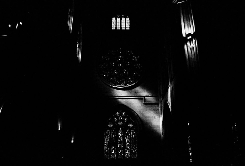
The next spread follows strongly with a shot of light pouring down through a church window within St. Mary's Cathedral. A form of sunlight coming down in a focused beam has always been seen as 'higher power' making contact, especially when the light lands on someone. Having this photo taken inside a church and the beam coming through the window making contact with the church wall is still very focused on the central theme.
The next spread takes a little step back and starts to get creative with the theme, also giving the viewer something new to look at with image placement. Keeping them interested in turning the page. The shot of water ripples in a fountain out the front of St Mary's Cathedral can be interpreted in many ways. For me, at first, it was just a stylistic shot, but put 'faith' as the explored theme and you can get different meanings for it. Holy water, baptism, cleansing, a new start, etc. It's completely up to the viewer how they see the image. The same goes for the shot taken inside of St Mary's Cathedral looking at one of its beautiful windows. It could hold the meaning of praying, again, completely up to the viewer. To me, both shots exude the meaning of faith when in the mindset.
The next few spreads are of Sydney and have had afterthoughts of faith. At the time they were taken I had no intention of these meaning anything, they were just shots taken while in Sydney, but looking at them now with the theme lingering in the air, I find certain aspects of faith in the photos.
For example, the birdcages hanging in the air were photographed on Angel Lane. Angels are a religious theme, and that ties into faith and belief.

The quote at the end of the zine 'Faith is power, believe in yourself' was something I thought of when looking through these photographs. I felt it was fitting, following the previous photograph.

I ended the zine with the photograph of a crowd going through a tunnel. Each and every person there is on their own path in life. The thought of where they're going, where they've come from is all up in the air. Only they know that, and all we can do is have faith that they know what they're doing, and in turn, have faith in ourselves with our own journey.
The stylistic choice of printing these photos on light pink paper came in when I updated the website's layout and design. Changing the site to have a slight magenta/pink background stemmed from my love of pastel colors in photography. When I implemented that into the site, I loved how the images looked ontop of this color, specifically the black and white photos. It then clicked to see how it would look in this photo-zine and I love it.
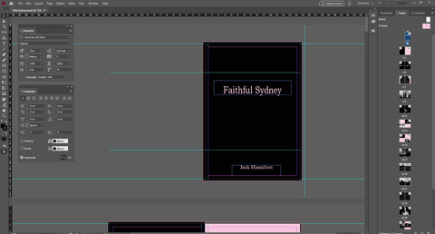
For the cover and layout of the book, I'm deciding to print this zine on A5 paper, portrait layout. The size of a diary. I originally had the idea to have the cover a cloth/leather material but the printshop I chose to print this book didn't have these options. So I went with the Hardcover gloss paper, thicker than the internals.
UPDATE
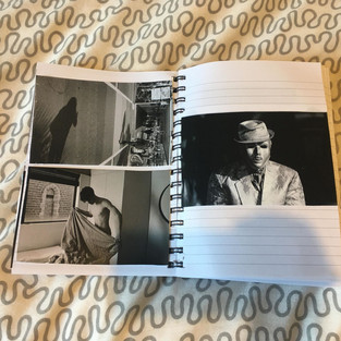
Faithful Sydney has been printed and delivered.
Here it is!

I had to change a few printing ideas as they weren't possible with the printing company I chose.
The biggest change is the hardcover. I wanted the material to be cloth or leather, just like a bible. I wanted this to keep the strong themes this book follows. Instead, I had to settle on a thick gloss cover, which for a first print is a safe option.
Being the first photo book I have printed, I knew I would run into a couple of problems and mistakes. This book was always a tester so I accept them and will remember for future projects.
The printing company I chose only had an online site and didn't do soft proofs, which I will definitely make sure the next print shop I choose has.
Since the photos are black and white, the way they look on a computer screen will be different to how they turn out on paper. In this case, the blacks were too dark in some images that they ended up bleeding together in the shadows. This only happened in two images. The details are still there, just not as prominent.


If you don't know what a soft proof is, it's a one-off print the printers send to you so you can make adjustments and notes for them, before the batch total is created.
It would have saved this problem from occurring if it was an option they had and if they communicated with me more frequently.

I ordered 25 prints, but they were kind enough to throw in another 10 for free.
If you would like to purchase a copy, they are $10 each. Message me directly if you're interested and I'll share the details with you and any other information you might want to know. I have set up a tab in the header called 'Faithful Sydney Photo Book' where you can purchase the book.
If you would like to see a video put together of how I made this book from start to finish, let me know, and if enough people are interested I'll put one together.
This next project is at the stage of being put together in InDesign and I will most likely be doing a video for it.
Enjoy some end results below and if you'd like to purchase a copy, follow the link to the store - https://www.jackhamilton.online/product-page/faithful-sydney-photo-book.


That is all for this blog post. Thanks for reading and I hope you left with some knowledge on what goes into creating a zine and how to do one yourself if that is something you're interested in doing.
If you have some questions, leave them in the comments or email me directly and I'd be happy to answer them to the best of my ability.
As always, join me next Friday at 12 pm, until then, look after yourself.


Comments